In preparation for starting this blog, I decided to clean up my website a bit. The biggest housekeeping task was throwing out Bootstrap since I was really only using it for the grid layout. In its place, I decided to try out flexbox.
If you’re unfamiliar with flexbox, MDN has a great tutorial series on it. At its core, it’s a CSS mechanism for flexibly laying out elements in one dimension (either horizontally or vertically). My site’s homepage now uses flexbox to display my picture and the accompanying text side-by-side in a responsive way.
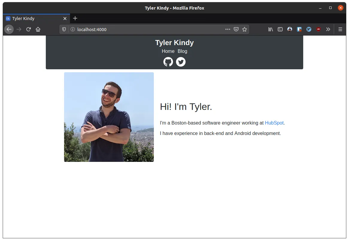
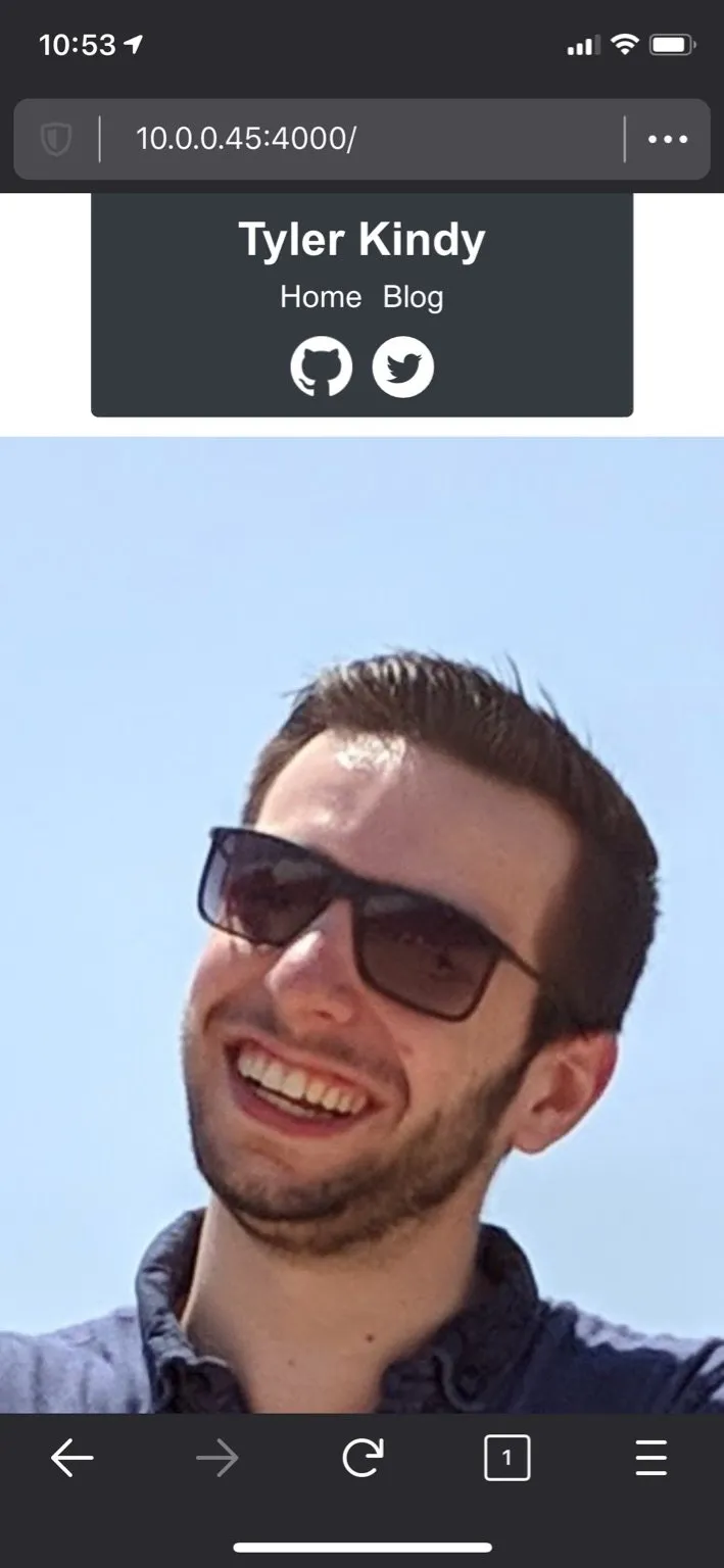
This worked great when I viewed it on my laptop. But after I’d published my changes, I checked it out on my phone, and the image was huge.
For whatever reason, this behavior didn’t show up in Firefox’s mobile emulator. I was confused because I had the following CSS rule:
.me-img {
  flex: 0 1 300px;
}
This should mean that the image starts at 300px by default and can shrink if there isn’t enough space, but it can’t grow. However, as you can see, the image appears to be larger than that flex-basis.
Unfortunately, I still haven’t been able to figure out what’s happening here. As a workaround, I included a max-width constraint on the image of the same size as the flex-basis. That seems to have properly clamped the size on mobile.